1,000 Little Likes: Helping a Company Find Their Voice on Facebook


A few months back our agency began working with a new client called “The Little Bottle Company”, a small business that sells custom arrangements of, you guessed it, little bottles. They were interested in boosting their online presence and jump-starting their brand awareness in the Alamo city with a Facebook campaign.
The Goal: Get Page Likes!
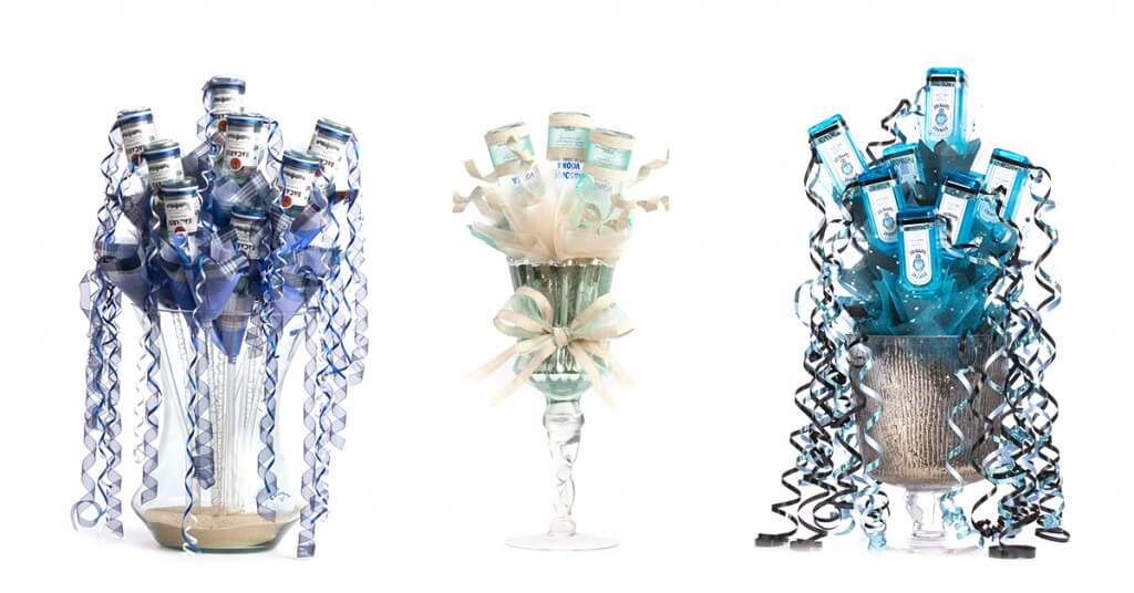
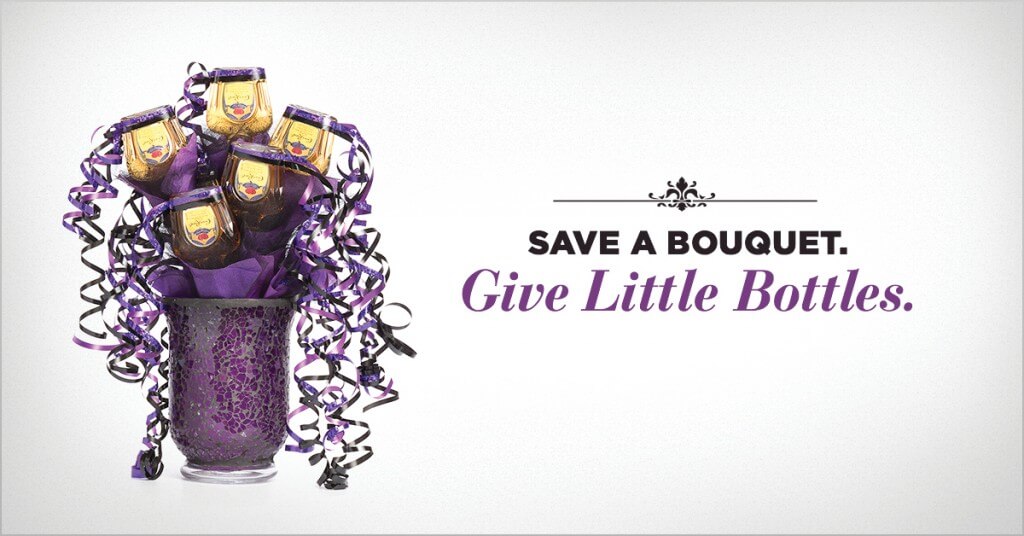
In all honesty, their arrangements are actually quite impressive and fun to look at. They’re also made of alcohol.
 Our team kicked off the project with a meeting to lay out the parameters. We had a large library of spectacular arrangement images and an otherwise blank canvas to fill. Starting a project with no foundation of brand look or voice can be equal parts liberating and intimidating.
The tricky part about advertising on Facebook is that the site penalizes your reach the more text you have on the creative. Facebook claims this policy keeps their site more visually appealing, but whatever the reasoning the drawback forces the messaging to be short and sweet. Knowing that I had to work in the provided photography while maintaining a concise message was a solid jumping off point.
The Concept:
The first direction we wanted to tackle was a “Father’s Day” campaign — create specific messages to encourage people to purchase a unique gift for Dad. Father’s Day giving always seems to revolve around the cliches: tools, ties, or bad chachkies dad neither needs nor wants. A Little Bottle arrangement felt like a strong alternative most men would neither expect nor retire to the back of a closet.
So I sat down to work.
Firstly, I needed something to complement the photography. I needed words. I needed headlines. So I did what all designers pretending to be copywriters do — I grabbed the nearest notepad and stared blankly at the emptiness.
I started talking to myself.
“Just get something down on paper, doesn’t have to be good,” became my mantra.
I just needed some words to get my design started and had no intention of writing actual copy. As a father of a two-year-old, I channeled my inner dad and began to ponder what all the Father’s Days of the future might look like.
NOTION 1: “Okay, we’re selling alcohol. Dads like alcohol. What do I want for Father’s Day? How about being left alone? And some alcohol.”
HEADLINE 1: What to get your dad THROUGH Father’s Day.
NOTION 2: “Man, they’ll never go for that. Whatever, just let it flow. Okay, what if we make fun of something I definitely do not want for Father’s Day?”
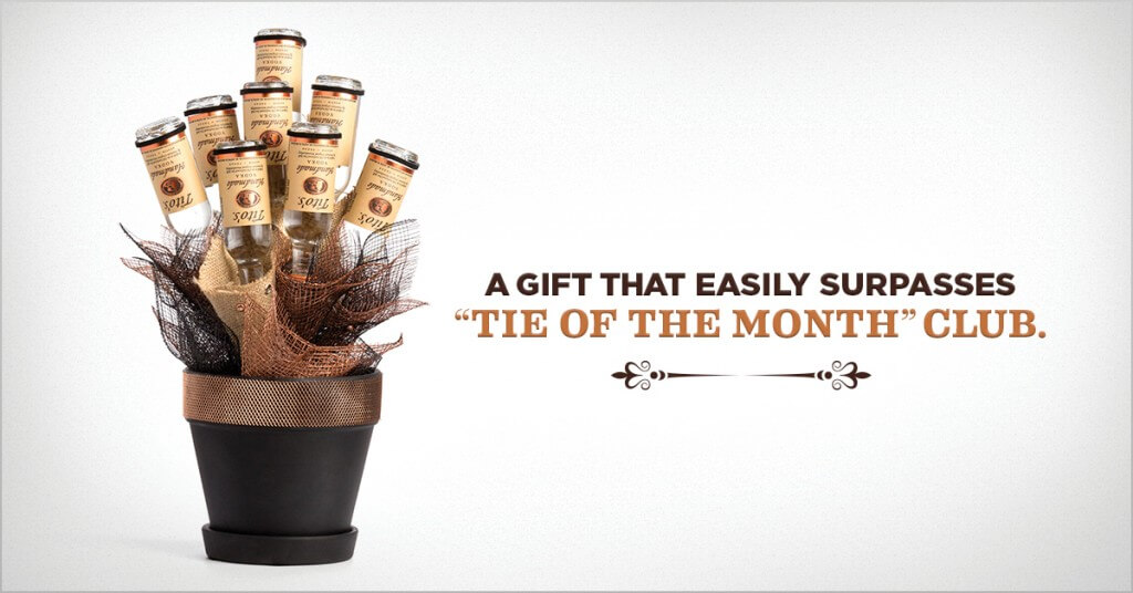
HEADLINE 2: A gift that easily surpasses “Tie of the Month” club.
NOTION 3: “Father’s Day is weird– on Mother’s Day you just buy flowers and/or take mom out to dinner. How come dads need a gift?”
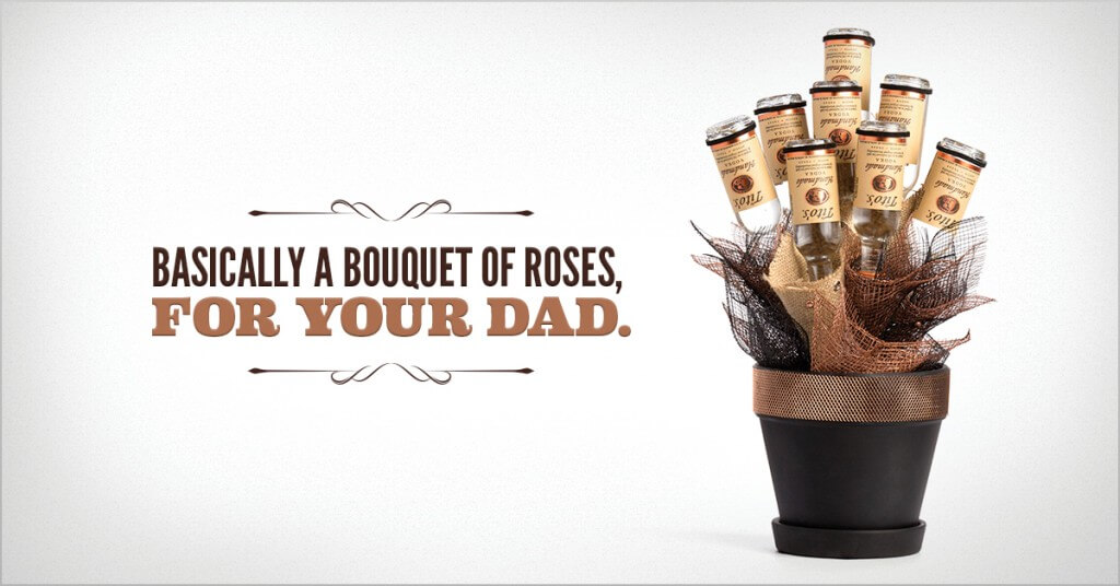
HEADLINE 3: Basically a bouquet of roses, for your dad.
NOTION 4: “Raising kids sure is a lot of work. Damn right they should repay us even if they don’t respect our effort. Oh yeah, I should probably get my dad something.”
HEADLINE 4: A small reward for raising you.
NOTION 5: “Not only are they a lot of work, but they do some messed up stuff. I know I did.”
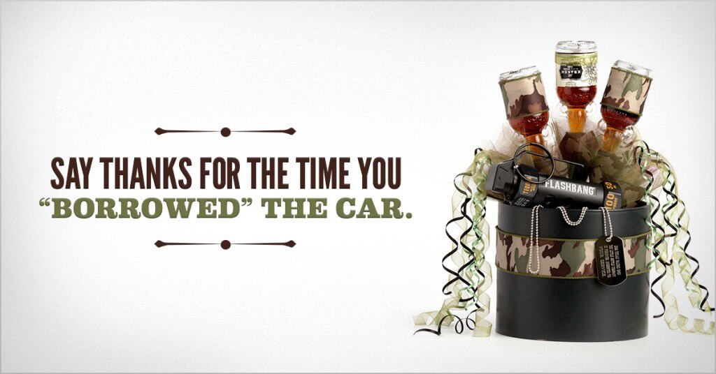
HEADLINE 5: Say Thanks for the time you “Borrowed” the car.
And so it went. They weren’t the greatest headlines man has ever seen, but for a designer short of time and bad with “the word things” they seemed like a decent place to start playing with layout.
The Layout:
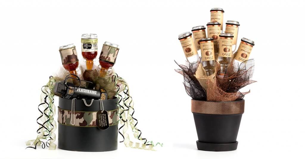 I started with two of the more masculine looking arrangements. Ultimately, I decided to use a clean background and let the arrangements stand by themselves. I knew I was going to be creating a lot of options, and keeping the background clean would inherently keep the campaign look cohesive while allowing me to swap arrangement styles and headlines easily.
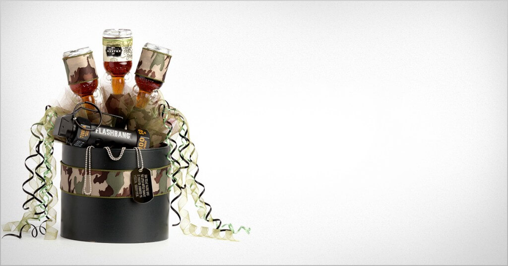 Adding a slightly off-white color and texture, plus a vignette gave the artwork a bit of depth and contrast from Facebook’s white background while maintaining a clean palette to add type.
I had my basic template ready to go — eye-catching arrangement on a soft background with plenty of room for the message. Now what I needed was some type design to bridge the playfulness of the arrangement, but spatially work inside Facebook’s guidelines.
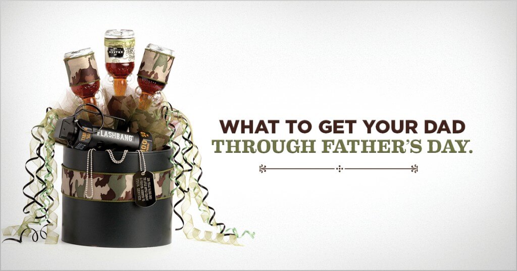 After a little trial and error, I settled on a few typefaces that felt bold enough to be legible at thumbnail size on a Facebook timeline. I wanted to utilize two faces to contrast the cadence of the headlines- essentially the build-up and then the payoff. A bit of color pulled from the photo would provide a color variation across different arrangement options. Lastly, I wanted to incorporate one more subtle design element to ground the headlines and opted for some ornamental dividers.
I spent a few hours creating mockups of all the least embarrassing headlines to share with our internal team. My goal was to say, “Here are what these final ads could look like once a real copywriter steps in.”
The Review:
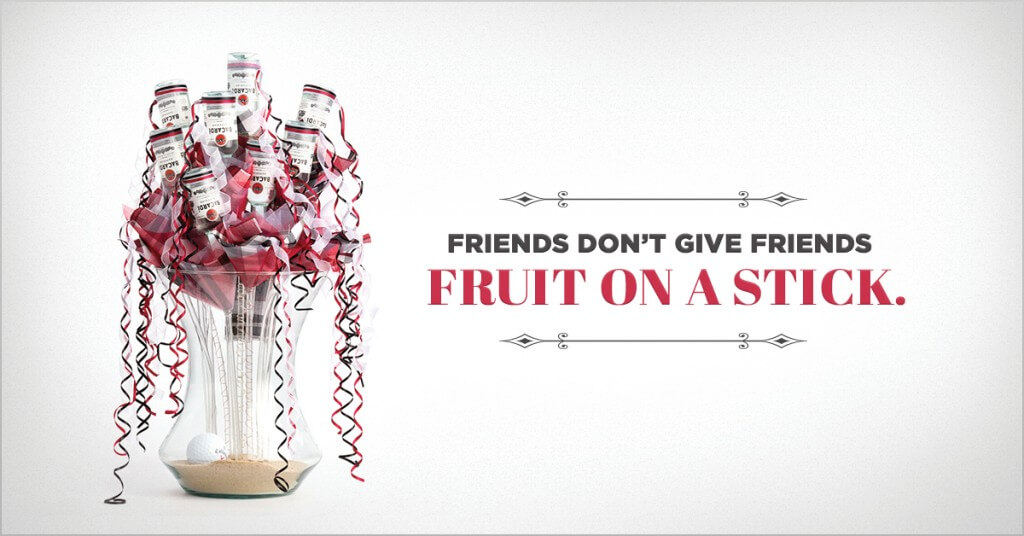
Much to my surprise, the internal team felt pretty good about the mock ups. We all liked the voice and, with a bit of culling, narrowed down our favorite options to share with the client. I also presented some additional ads loosely targeted for general market awareness. Same snark, slightly less masculine.
 With the amount of overwhelming positivity from the internal team, I was certain things wouldn’t go over well with the client. That’s just the jaded pessimism I’ve built up over the years from being blindsided by rejection. But to my chagrin, the ads were received as strongly externally as they were internally, and it was decided to run most of them as they were.
The Result:
Our team ended up launching 3 different Facebook campaigns in June: Fathers Day, General Awareness, and Grand Opening. Along with some savvy social media management and organic postings, our paid advertisements helped bring in over 1,000 new Facebook Page Likes — up from less than 50! We didn’t exactly change the world, but hopefully brought a few chuckles to the denizens of Facebook and converted some of them into new clients for The Little Bottle Company.
And maybe some dads finally got a decent Father’s Day gift.