Blog Posts - Author: Michael Streubert
A place where we discuss the communication industry and give our insights on advertising, website development, graphic design and strategic planning.

Category:Graphic Design
SKETCH VS. XD SHOWDOWN
I’ve been designing websites in Sketch for the last 5 years, and I’ll admit that removing the process from Adobe Photoshop/Illustrator felt like the most powerful software revolution in the design ecosystem since we abandoned Quarkxpress.
But recently it has come to my attention that Adobe XD may be making enough headway to usurp Sketch from atop the UI/UX throne. So for my last web project I decided to dust off my Udemy account and fire up some YouTube videos and learn more about XD.

Twitch: Engagement is the Name of the Game
DO YOU WANT TO PLAY A GAME?
A couple weeks ago a news story probably didn’t break into your bubble, but it showcased a significant indicator of generational sea change in media consumption and messaging.
Two United States congress(wo)men played a video game. It was a pretty big hit.
In an effort to engage the youngest generation of voters in the United States (not coincidentally the least likely to participate in the political process), Representatives Alexandria Ocasia-Cortez and Ilhan
Improving Your Paragraph Styles
Over the last few years, I’ve become a massive proponent of Paragraph Styles, even to the point where I’m happy to set up a unique style for all repeatable type treatments in any InDesign document that crosses my desk.
Paragraph styles are a powerful feature in InDesign that often go overlooked and underutilized. While they can seem clunky to set up, their efficiency in making global changes should always offset the initial time investment.
While most designers should be familiar
Quick, Easy Multipanel Brochure Mockup (InDesign)
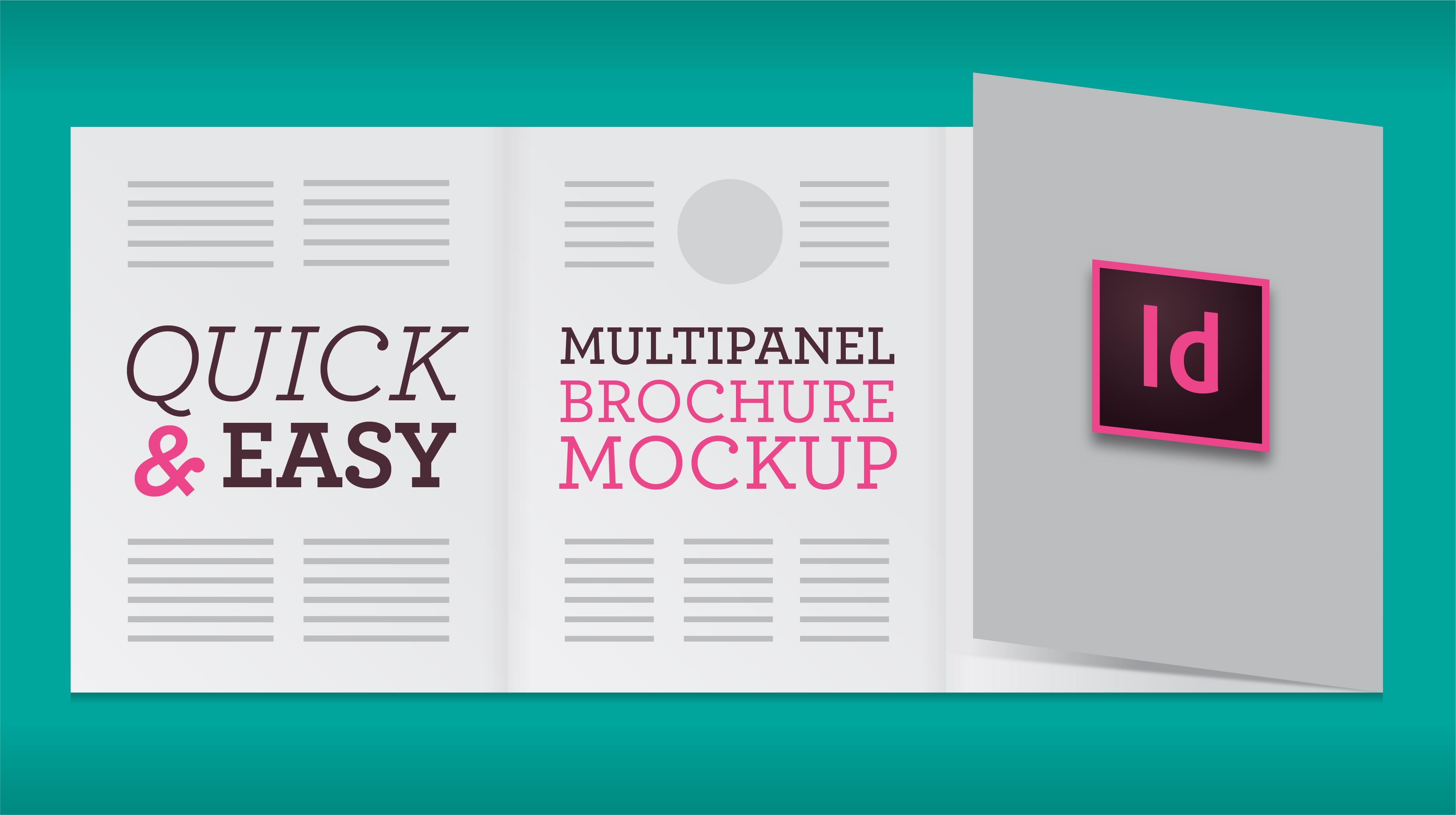
Presentation isn’t everything; but it’s certainly massively important. This is something I’ve picked up over my career by watching some of the best designers sell their work.
The issue came up recently when I wanted to demonstrate a brochure layout to a client who was uncommitted to a specific design. Everyone can immediately visualize a generic brochure, but there’s a surprising amount of directions to go– letter-fold, z-fold or gate-fold? Pocket or flap? Can it hold a business
Category:Graphic Design
The 5 Stages of Designing in Microsoft Office
A satirically cynical guide for coping with your next project.
There comes a time in every designer’s career when a dark cloud descends over our pastoral workspace and someone commissions an original design created in Microsoft Word, Excel, or PowerPoint. A dubious request, castrating our professional expertise, the Microsoft Office “Template” has the side-effect of sending any seasoned artist into an emotional, design-purgatory. Yet there is light at the end of the tunnel, and
Category:Graphic Design
5 Things I Would Magically Change About Adobe Indesign
I want to get this out of the way— Adobe Indesign is a great program which I depend on daily. It’s the industry standard for page design, and for good reason: it’s reliable, easy to use, and incredibly robust in the features department.
But I’m a world class complainer who can find fault in anything, so I thought I’d make this my new blog series: Michael Complains about (Design Program). All of the following items are minor issues I would love to see “fixed.”
1. Controlling Columns
Category:Graphic Design
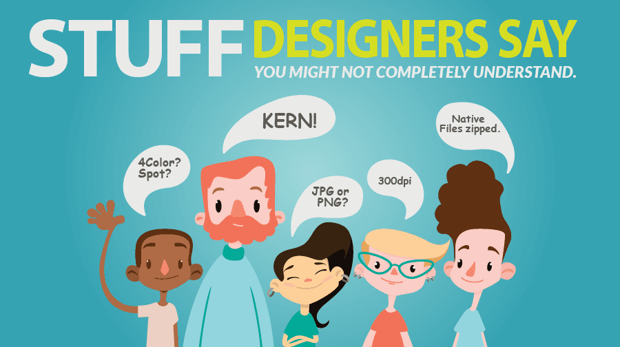
STUFF Designers say you might not completely understand
Over the years I’ve noticed most people in our industry know how to “speak designer.” With that said there are a handful of terms or issues that routinely come up that seem to cause confusion. Here’s a short list of some of the most common offenders and how they’re defined by a designer.
TYPE:
Distressed: Essentially type that looks worn – think of old painted letters on the side of a 50 year old exterior wall.
Typeface: A specific style of alphanumeric characters. E.g. Times New Rom
Automated form-field styling: Goodbye Times New Roman, hello Acrobat.
Have you ever had to create an Indesign document that incorporated form fields spread across many pages? Has a co-worker discovered you sobbing quietly at your desk while manually updating font styles using acrobat’s “Prepare Forms” tool? Well, if you said “No” or “What the H$%# are you talking about” then read no more.
If you answered “Yes!”, I’m sorry you have to work on forms, but hopefully, this will save you a ton of time.
I recently discovered a simple Javas
1,000 Little Likes: Helping a Company Find Their Voice on Facebook
A few months back our agency began working with a new client called “The Little Bottle Company”, a small business that sells custom arrangements of, you guessed it, little bottles. They were interested in boosting their online presence and jump-starting their brand awareness in the Alamo city with a Facebook campaign.
The Goal: Get Page Likes!
In all honesty, their arrangements are actually quite impressive and fun to look at. They’re also made of alcohol.
Our team kicked off the project w