Blog Posts - Author: Josh Norman
A place where we discuss the communication industry and give our insights on advertising, website development, graphic design and strategic planning.
Straighten Paper Garland Using Photoshop’s Puppet Warp Tool
By Josh Norman
It has been obvious since the debut of Adobe Photoshop in 1990 that its possible uses would be endless, particularly since the introduction of layers in Photoshop way back in 1994. In 2013, Photoshop introduced Puppet Warp, a feature that lets you select areas of an image, add pivot points, and move parts of the image like a manikin figurine. (The feature has since been added to Illustrator, too, for editing vector shapes.)
I recently used this feature to straighten an image of paper garland tha
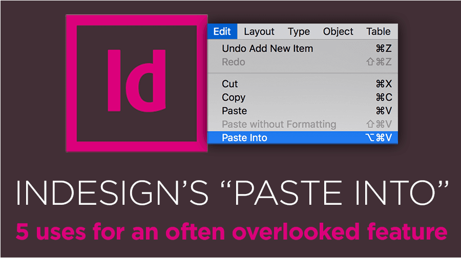
InDesign’s “Paste Into”: 5 Uses for an Often Overlooked Feature
By Josh Norman
If you’ve spent any time with Adobe InDesign, you know essentially every element you place or draw on a page is a frame of some sort. Those frames can contain anything including a color, a color gradient, an image, text, or table. Your collection of frames and their content make up your entire page’s design. Frames can be rectangles, ovals, hexagons – even a freehand shape.
You can create advanced visual effects in a frame by using InDesign’s “paste into” feature, which allows
Kick some .ASEs: Delivering Thorough Assets to Build a Better Brand
By Josh Norman
There’s nothing more exciting to a designer than being given the chance to create or recreate a brand, and all that comes with it: from the logomark and logotype to the brand voice, design hallmarks, grids, font families, and colors. It’s a rare opportunity to mold a brand from the ground up and to create a personality that fits a company’s beliefs and values.
Once the long road of research, exploratory, presentation, revisions and approval has reached its end (and congratulations if the r
Converting spot color to process color in Illustrator or InDesign (You’re probably doing it wrong)
By Josh Norman
If you’ve been designing logos for brands or working in print design for more than the last 7 years or so, you likely felt the earth shake a bit in 2010 when Pantone introduced their Pantone Plus color matching system, which was developed to help printed PMS colors reproduce more accurately on computer displays. It was a move meant to better connect on-screen color with on-page color, but it came with unfortunate side effects to the average designer’s workflow. The worst of these side effect
Category:Graphic Design
Avoiding a Fontastrophe: Why You Should Never Ask Your Agency to Send Fonts to You
By Josh Norman
Fonts. They’re literally everywhere you look, on everything you read. Many times, they are a core component of graphic design and website development. Type purists like to point out, “You can’t even design without type.” And that’s true, assuming your work requires something to be read.
With our eyes so trained to recognize words thousands of times throughout the course of any given day, it’s no wonder that the legality of font usage can be so easily overlooked. It’s almost akin to

Category:Graphic Design
A Designer’s Guide to Mastering Text Styles in Microsoft Word
By Josh Norman
… or, That One Time Word Didn’t Make Me Want to Walk Off the Job and Sell Used Tires for a Living.
There are a handful of phrases that make designers want to tuck their tails between their legs and run home to mommy: “Let’s fill up this white space to take advantage of the entire spread.” Or, “Can we make this pop more?” And, perhaps the king of them all, “Can you give me this layout in a Word document so I can make edits myself?”
Ah, Microsoft Word. The one piece of software t

Fresh (and ancient) perspectives on the evolution of brands
By Josh Norman
Creative people have a knack for finding inspiration in unexpected places, and for following lines of thinking into new spaces. It’s an effective way to keep unique ideas flowing, even if some of them turn out to be useless. The hunt is always on, though: What’s the one great concept that could make a single piece of creative or an entire advertising campaign exceptional?
I recently started handpicking audiobooks that I would listen to while driving to and from work each day. I was surprised