Blog Posts - Graphic Design
A place where we discuss the communication industry and give our insights on advertising, website development, graphic design and strategic planning.

Grave Digging in the Creative Boneyard
Marketing can be truly gruesome work. As deadlines loom, creative teams often toil away into the wee hours of the night, our bloodshot eyes crying out for relief. Even if these poor creatures do manage to slip into peaceful slumber, we’re often jolted awake by the sudden spark of an idea.
Concepts crawl out from the back rooms of our creative brains and threaten to haunt our dreams. But when the final deck is put together, there can be only one victor. The rest of those noble stabs at marketin

Category:Graphic Design
Be the Master of your Creative Workflow on the Mac
As a designer, I’m a master at the Adobe suite of creative apps. I firmly believe that the key to mastery is knowing your tools. Part of that, however, is understanding when tools could be improved or extended for your particular workflow.
This can mean simple tools for the Mac OS Finder, command line tools, creating standalone apps, or simply choosing a better tool to accomplish a task. Here’s a look at some of the tools and apps I’ve developed to enhance my productivity in my daily creat

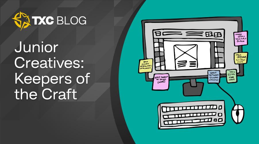
Junior Designer: The Role AI Tried to Replace (But Could Never)
Being a TXCer means I like to sit front row, and for me that means subscribing to some cool design substacks. Recently, I stumbled across a post by Carly Ayres – a writer and design strategist at Figma – that spoke to the importance of junior designers. My first thought was, “Hey, that’s me! How nice of you to say!”
After reading more, I think she’s totally right about emerging AI, the declining rate of junior roles, and what both could do to our industry. Some AI tools can do things

The Subtle Art of Making Data Look Cool: My Annual Report Obsession
I have been around print and art for as long as I can remember, it’s definitely shaped my life and ultimately my career. My dad worked at a print shop, and my mom is a fine artist – I am the ultimate combination of both worlds.
Print is something I was always drawn to, whether that was seeing the presses at my dads work running large sheets of paper full of text and design or seeing my moms old hippy poster designs full of swirling and dancing text. And now, in my career, I have found myself

Category:Graphic Design
InDesign Essential Tips: 5 simple ways you should be using paragraph styles
Hello aspiring InDesigners! Let’s talk paragraph styles. When laying out a text-heavy document, not only will these bad boys keep your type consistent across multiple page layouts (and multiple projects), but it’ll also make editing so much easier across the entire document. If the options are overwhelming, check out this quick cheat sheet for starters:
Basic Character Formats
This is the traditional formatting of font, weight, size, leading, etc. If you’re going to underline or bold only

Category:Graphic Design
Adobe XD: On pause, dead as Pagemill and Muse – or ripe for rebirth?
By Josh Norman
It wasn’t long ago that designers deeply entrenched in Adobe’s Creative Cloud ecosystem were PUMPED. Sketch was nice but it was standalone. Figma seemed promising. But Adobe XD had the promise of being the Harry Potter of web design – the chosen one.
XD was built from the ground up with built-in prototyping, animations and transitions, repeat grids, scroll groups, and a plugin library to help collaborate with developers, test for accessibility, import placeholder images and text, and at le

Opinion: Is that new Kia logo any good?
By Josh Norman
Rolling out new corporate branding is a lot of things to a lot of stakeholders. For an agency like Texas Creative, it’s a unique opportunity to help refresh and reshape a client’s core identity. However, for most companies it’s an expensive endeavor and carries the fear of losing brand equity, indicating that something is or was wrong with their brand and requires a new narrative, and it carries the added work and costs involved with planning a rollout that leverages the newsworthiness of

Create an animated mobile menu in Adobe XD
By Josh Norman
As mentioned in a previous blog by art director Michael Streubert, we’ve been exploring Adobe XD recently as an alternative to Sketch for UI design work. While I agree with much of Michael’s Sketch vs. XD showdown, I find myself more on Team XD than Michael (and won’t even hold it against him much), primarily because of XD’s built-in prototyping and animation tools.
So, let’s do something today in XD that’s not possible using Sketch alone: design, prototype, and animate a mobile menu

Category:Graphic Design
The Psychology of Color in Marketing
By Texas Creative
When it comes to color, context is everything. A pinch of a particular color could produce an appealing composition, while too much of the identical color could disrupt it.
Here is an overview of basic color meanings:
White:
The use of white color in business signifies cleanliness and hygiene. It indicates calmness, simplicity, and organization. White has been elected as a symbol of goodness, spirituality, purity, balance, perfection, hope, and honesty. You may find this color used a lot f

Category:Graphic Design
SKETCH VS. XD SHOWDOWN
I’ve been designing websites in Sketch for the last 5 years, and I’ll admit that removing the process from Adobe Photoshop/Illustrator felt like the most powerful software revolution in the design ecosystem since we abandoned Quarkxpress.
But recently it has come to my attention that Adobe XD may be making enough headway to usurp Sketch from atop the UI/UX throne. So for my last web project I decided to dust off my Udemy account and fire up some YouTube videos and learn more about XD.